After many people asked me on Twitter about my thoughts on the new icon and Instagram design refinements, I thought it might be best to make a quick video. PS: I do not work at Instagram, I’m just someone who loves the app. Thoughts and feedback right in the comments.
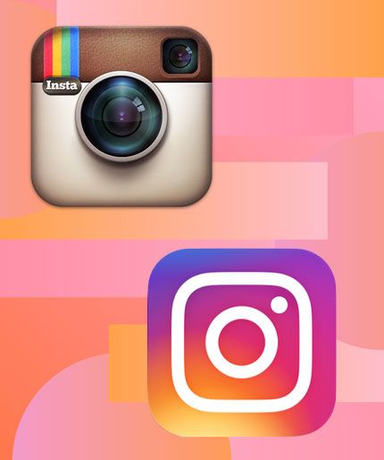
Today, you can say goodbye to the Instagram icon you know and love. That’s right, Instagram is rolling out a new logo design today. While it takes some cues from its old friendly, familiar camera icon, it has a decidedly different (and much simpler) look.
Are you ready? Here it is:
If your first thought is What is this nonsense?! just take a second to hear out Instagram’s reasoning for the change.
“Brands, logos, and products develop deep connections and associations with people, so you don’t just want to change them for the sake of novelty,” Ian Spalter, Instagram’s head of design, wrote in a blog post on Medium. “But the Instagram logo and design was beginning to feel, well… not reflective of the community, and frankly we thought we could make it better.”
Instagram first debuted its faux leather-clad camera icon four years ago (and the app itself is five years old). Back then, all you could do on Instagram was take and share photos, painting them with a filter. Nowadays, you can share photos, videos, collages, GIF-like Boomerangs, and Hyperlapses, and you can discover all sorts of new content in its Explore tab. With all that in mind, it makes sense that Instagram would eventually want to evolve from its vintage-looking camera icon, and the company’s been working on this new design for almost a year.
The app did try to keep a few key aspects from its old logo: the rainbow, and the camera lens. The rainbow manifests itself in the warm gradient, while the camera lens is evident in the super minimalist camera glyph in the icon.
Naturally, Instagram expanded this new color gradient and glyph-styling to its entire suite of apps (Layout, Hyperlapse, and Boomerang). You can get more detail about how Instagram arrived at this design in the video below.
In addition to the new icon, Instagram also made some design tweaks in the app itself. Gone are the blue buttons and navigation bar at the top and bottom of the app. Now, those are white, so the only pops of color come from the photos themselves (and those little orange notification icons). There are also some subtle differences between the iOS and Android app that aren’t too noticeable unless you’ve got the two versions side-by-side.
Instagram from Rachael Park on Vimeo.
Genesis of an icon
3 inspiring days kicked off with hands-on workshops, where 3 of the most well respected professionals in the industry revealed their techniques in Sketching, Designing for Emotion and e-Commerce Performance. The location, the Royal Tropical Institute, a hub that researches and publishes knowledge from around the globe, was an apt setting for a cutting edge web design event.
Rise went to work, and in about 45 minutes,
the Instagram logo was born. — JOSH BREWER
A few years back, it was the design style du jour for app logos to be as intricate and detailed as possible — partly to show off the awesome new high-resolution screens of our new smartphones. But now, with so many apps on our home screen, all that detail is overkill. And something simple, like Twitter’s bird icon and Facebook’s “f” logo, may catch your eye more quickly, anyway.
Now, Instagram’s got its own minimalist app icon, too.


Donec efficitur lectus orci, blandit tincidunt lorem aliquet nec. Ut eu ante in nisi volutpat lobortis. Maecenas sit amet neque eget erat dictum euismod. Vivamus lorem orci, blandit ornare tempor quis.
Aliquam consectetur erat sagittis eleifend fringilla. Nunc mollis egestas placerat. Praesent commodo, urna nec placerat egestas, tortor ex lobortis quam.
Morbi commodo malesuada mattis. Vestibulum euismod quam quis nisl maximus, sit amet feugiat enim posuere. Morbi sem magna, interdum a diam vel, semper hendrerit erat. In consectetur, justo a interdum dignissim, urna massa condimentum ante, eu aliquam elit eros quis leo.